3 Tools for Describing the Relationship Between Two Quantitative Variables
3.1 Introduction to Bivariate Data1
Measures of central tendency, variability, and spread summarize a single variable by providing important information about its distribution. Often, more than one variable is collected on each individual. For example, in large health studies of populations it is common to obtain variables such as age, sex, height, weight, blood pressure, and total cholesterol on each individual. Economic studies may be interested in, among other things, personal income and years of education. As a third example, most university admissions committees ask for an applicant’s high school grade point average and standardized admission test scores (e.g., SAT). In this chapter we consider bivariate data, which for now consists of two quantitative variables for each individual. Our first interest is in summarizing such data in a way that is analogous to summarizing univariate (single variable) data.
By way of illustration, let’s consider something with which we are all familiar: age. Let’s begin by asking if people tend to marry other people of about the same age. Our experience tells us “yes,” but how good is the correspondence? One way to address the question is to look at pairs of ages for a sample of married couples. Table 3.1 below shows the ages of 10 married couples. Going across the columns we see that, yes, husbands and wives tend to be of about the same age, with men having a tendency to be slightly older than their wives. This is no big surprise, but at least the data bear out our experiences, which is not always the case.
| Husband | 36 | 72 | 37 | 36 | 51 | 50 | 47 | 50 | 37 | 41 |
| Wife | 35 | 67 | 33 | 35 | 50 | 46 | 47 | 42 | 36 | 41 |
The pairs of ages in Table 3.1 are from a dataset consisting of 282 pairs of spousal ages, too many to make sense of from a table. What we need is a way to summarize the 282 pairs of ages. We know that each variable can be summarized by a histogram (see Figure 3.1) and by a mean and standard deviation (See Table 3.2).

| Mean | Standard Deviation |
|
|---|---|---|
| Husbands | 49 | 11 |
| Wives | 47 | 11 |
Each distribution is fairly skewed with a long right tail. From Table 3.1 we see that not all husbands are older than their wives and it is important to see that this fact is lost when we separate the variables. That is, even though we provide summary statistics on each variable, the pairing within couple is lost by separating the variables. We cannot say, for example, based on the means alone what percentage of couples has younger husbands than wives. We have to count across pairs to find this out. Only by maintaining the pairing can meaningful answers be found about couples per se. Another example of information not available from the separate descriptions of husbands and wives’ ages is the mean age of husbands with wives of a certain age. For instance, what is the average age of husbands with 45-year-old wives? Finally, we do not know the relationship between the husband’s age and the wife’s age.
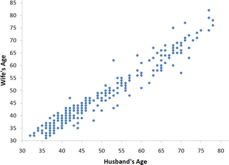
We can learn much more by displaying the bivariate data in a graphical form that maintains the pairing. Figure 3.2 shows a scatter plot of the paired ages. The x-axis represents the age of the husband and the y-axis the age of the wife.
There are two important characteristics of the data revealed by Figure 3.2. First, it is clear that there is a strong relationship between the husband’s age and the wife’s age: the older the husband, the older the wife. When one variable (Y) increases with the second variable (X), we say that \(X\) and \(Y\) have a positive association. Conversely, when \(Y\) decreases as \(X\) increases, we say that they have a negative association.
Second, the points cluster along a straight line. When this occurs, the relationship is called a linear relationship.
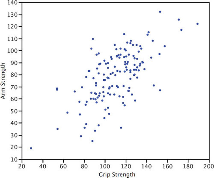
Figure 3.3 shows a scatter plot of Arm Strength and Grip Strength from 149 individuals working in physically demanding jobs including electricians, construction and maintenance workers, and auto mechanics. Not surprisingly, the stronger someone’s grip, the stronger their arm tends to be. There is therefore a positive association between these variables. Although the points cluster along a line, they are not clustered quite as closely as they are for the scatter plot of spousal age.
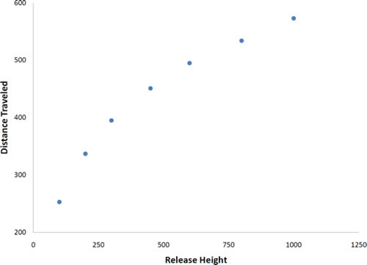
Not all scatter plots show linear relationships. Figure 3.4 shows the results of an experiment conducted by Galileo on projectile motion.2 In the experiment, Galileo rolled balls down an incline and measured how far they traveled as a function of the release height. It is clear from Figure 3.4 that the relationship between “Release Height” and “Distance Traveled” is not described well by a straight line: If you drew a line connecting the lowest point and the highest point, all of the remaining points would be above the line. The data are better fit by a parabola (a type of curved line).
Scatter plots that show linear relationships between variables can differ in several ways including the slope of the line about which they cluster and how tightly the points cluster about the line. We now turn our attention to a statistical measure of the strength of the relationship between two quantitative variables.
3.2 What is Correlation?3
The Pearson product-moment correlation coefficient is a measure of the strength of the linear relationship between two variables. It is referred to as Pearson’s correlation or simply as the correlation coefficient. If the relationship between the variables is not linear, then the correlation coefficient does not adequately represent the strength of the relationship between the variables.
The symbol for Pearson’s correlation is “\(\rho\)” when it is measured in the population and “r” when it is measured in a sample. Because we will be dealing almost exclusively with samples, we will use r to represent Pearson’s correlation unless otherwise noted.
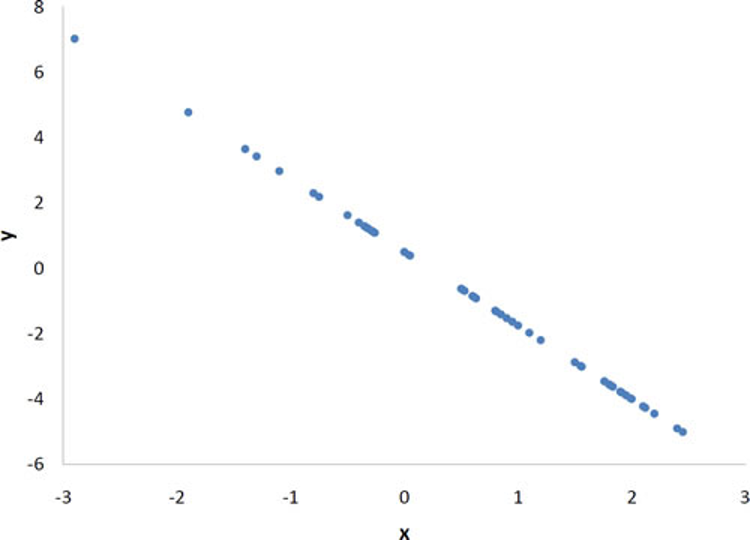
Pearson’s r can range from -1 to 1. An r of -1 indicates a perfect negative linear relationship between variables, an r of 0 indicates no linear relationship between variables, and an r of 1 indicates a perfect positive linear relationship between variables. Figure 3.5 shows a scatter plot for which r = 1.
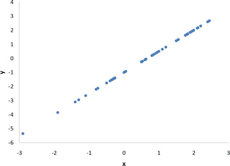
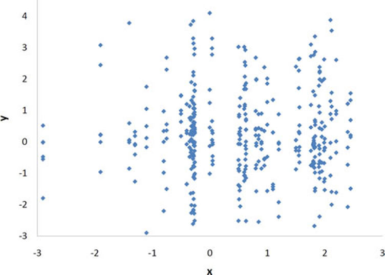
With real data, you would not expect to get values of r of exactly -1, 0, or 1. The data for spousal ages shown earlier in this chapter in Figure 3.2 has an r of 0.97.
The relationship between grip strength and arm strength depicted in Figure 3.3 (also described in the introductory section) is 0.63.
3.3 How Correlation is Calculated4
There are several formulas that can be used to compute Pearson’s correlation. Some formulas make more conceptual sense whereas others are easier to actually compute. We are going to begin with a formula that makes more conceptual sense.
We are going to compute the correlation between the variables \(X\) and \(Y\) shown in Table 3.3. We begin by computing the mean for \(X\) and subtracting this mean from all values of \(X\). The new variable is called “x.” The variable “y” is computed similarly. The variables x and y are said to be deviation scores because each score is a deviation from the mean. Notice that the means of x and y are both 0. Next we create a new column by multiplying x and y.
Before proceeding with the calculations, let’s consider why the sum of the xy column reveals the relationship between \(X\) and \(Y\). If there were no relationship between \(X\) and \(Y\), then positive values of x would be just as likely to be paired with negative values of y as with positive values. This would make negative values of xy as likely as positive values and the sum would be small. On the other hand, consider Table 3.3 in which high values of \(X\) are associated with high values of \(Y\) and low values of \(X\) are associated with low values of \(Y\). You can see that positive values of x are associated with positive values of y and negative values of x are associated with negative values of y. In all cases, the product of x and y is positive, resulting in a high total for the xy column. Finally, if there were a negative relationship then positive values of x would be associated with negative values of y and negative values of x would be associated with positive values of y. This would lead to negative values for xy.
| X | Y | x | y | xy | x2 | y2 | |
|---|---|---|---|---|---|---|---|
| 1 | 4 | -3 | -5 | 15 | 9 | 25 | |
| 3 | 6 | -1 | -3 | 3 | 1 | 9 | |
| 5 | 10 | 1 | 1 | 1 | 1 | 1 | |
| 5 | 12 | 1 | 3 | 3 | 1 | 9 | |
| 6 | 13 | 2 | 4 | 8 | 4 | 16 | |
| Total | 20 | 45 | 0 | 0 | 30 | 16 | 60 |
| Mean | 4 | 9 | 0 | 0 | 6 |
Pearson’s r is designed so that the correlation between height and weight is the same whether height is measured in inches or in feet. To achieve this property, Pearson’s correlation is computed by dividing the sum of the xy column (\(\sum{xy}\)) by the square root of the product of the sum of the \(x^2\) column (\(\sum{x^2}\)) and the sum of the \(y^2\) column (\(\sum{y^2}\)). The resulting formula is:
\[ r = \frac{\sum{xy}}{\sqrt{\sum{x^2}\sum{y^2}}}\ \]
and therefore:
\[ r = \frac{30}{\sqrt{(16)(60)}} = \frac{30}{\sqrt{960}} = \frac{30}{30.984} = 0.968\ \]
An alternative computational formula that avoids the step of computing deviation scores is:
\[ r = \frac{\sum{XY}-\frac{\sum{X}\sum{Y}}{n}}{\sqrt{\left(\sum{X^2}-\frac{(\sum{X})^2}{n}\right)}\sqrt{\left(\sum{Y^2}-\frac{(\sum{Y})^2}{n}\right)}} \]
3.4 Introduction to Linear Regression5
In simple linear regression, we predict scores on one variable from the scores on a second variable. The variable we are predicting is called the dependent variable and is referred to as \(Y\). The variable we are basing our predictions on is called the independent variable and is referred to as \(X\). When there is only one predictor variable, the prediction method is called simple regression. In simple linear regression, the topic of this section, the predictions of \(Y\) when plotted as a function of \(X\) form a straight line.
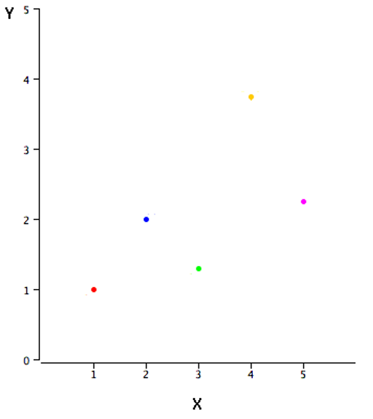
The example data in Table 3.4 are plotted in Figure 3.8. You can see that there is a positive relationship between \(X\) and \(Y\). If you were going to predict \(Y\) from \(X\), the higher the value of \(X\), the higher your prediction of \(Y\).
| \(X\) | \(Y\) | ||
|---|---|---|---|
| 1.00 | 1.00 | ||
| 2.00 | 2.00 | ||
| 3.00 | 1.30 | ||
| 4.00 | 3.75 | ||
| 5.00 | 2.25 |
Linear regression consists of finding the best-fitting straight line through the points. The best-fitting line is called a regression line. The black diagonal line in Figure 3.9 is the regression line and consists of the predicted score on \(Y\) for each possible value of \(X\). The vertical lines from the points to the regression line represent the errors of prediction. As you can see, the red point is very near the regression line; its error of prediction is small. By contrast, the yellow point is much higher than the regression line and therefore its error of prediction is large.
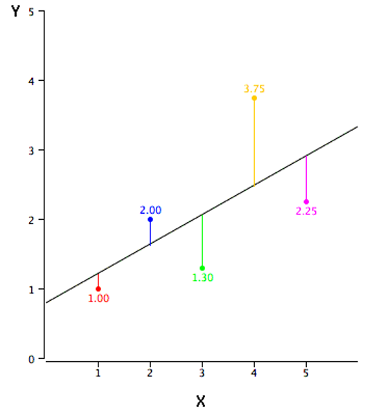
The error of prediction for a point is the value of the point minus the predicted value (the value on the line). Table 3.5 shows the predicted values (\(\hat{Y}\)) and the errors of prediction (\(Y-\hat{Y}\)). For example, the first point has a \(Y\) of 1.00 and a predicted \(Y\) (called \(\hat{Y}\)) of 1.21. Therefore, its error of prediction is -0.21.
| \(X\) | \(Y\) | \(\hat{Y}\) | \(Y-\hat{Y}\) | \((Y-\hat{Y})^2\) | ||
|---|---|---|---|---|---|---|
| 1.00 | 1.00 | 1.210 | -0.210 | 0.044 | ||
| 2.00 | 2.00 | 1.635 | 0.365 | 0.133 | ||
| 3.00 | 1.30 | 2.060 | -0.760 | 0.578 | ||
| 4.00 | 3.75 | 2.485 | 1.265 | 1.600 | ||
| 5.00 | 2.25 | 2.910 | -0.660 | 0.436 |
You may have noticed that we did not specify what is meant by “best-fitting line.” By far, the most commonly-used criterion for the best-fitting line is the line that minimizes the sum of the squared errors of prediction. That is the criterion that was used to find the line in Figure 3.9. The last column in Table 3.5 shows the squared errors of prediction. The sum of the squared errors of prediction shown in Table 3.5 is lower than it would be for any other regression line.
The formula for a regression line is
\[ \hat{Y} = \alpha + \beta X \]
where \(\hat{Y}\) is the predicted score, \(\alpha\) is the \(Y\)-intercept, and \(\beta\) is the slope of the line. The equation for the line in Figure 3.9 is
\[ \hat{Y} = 0.785 + 0.425X \]
Using this equation, we can calculate predictions for \(Y\) based on the value of \(X\). For \(X\) = 1,
\[ \hat{Y} = 0.785 + (0.425)(1) = 1.21. \]
For \(X\) = 2,
\[ \hat{Y} = 0.785 + (0.425)(2) = 1.64. \]
3.4.1 A Real Example
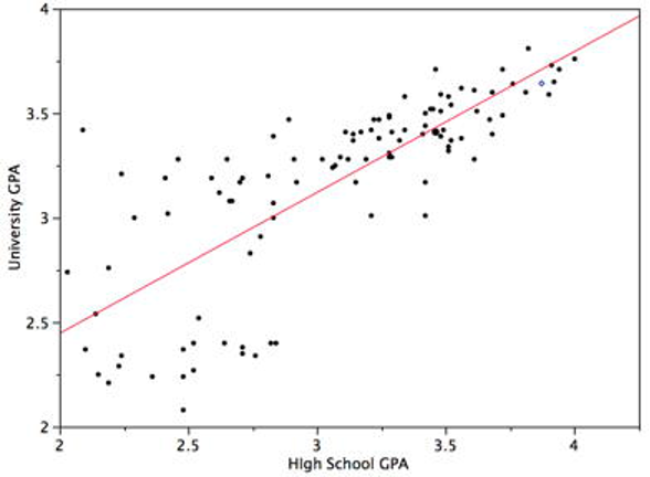
The case study “SAT and College GPA”6 contains high school and university grades for 105 computer science majors at a local state school. We now consider how we could predict a student’s university grade point average (GPA) if we knew his or her high school GPA.
Figure 3.10 shows a scatter plot of University GPA as a function of High School GPA. You can see from the figure that there is a strong positive relationship. The correlation is 0.78. The regression equation is
\[ \widehat{University\_GPA} = (0.675)(High School GPA) + 1.097 \]
Therefore, a student with a high school GPA of 3 would be predicted to have a university GPA of
\[ \widehat{University\_GPA} = (0.675)(3) + 1.097 = 3.12. \]
3.5 Quick Guide to Interpreting Regression Results7
Many social science papers report their main results in the form of a regression table. It’s fairly easy to get started interpreting these results using the three S’s:8
Significance: Is the relationship between the two variables strong enough (relative to the precision of the estimate) to be considered statistically reliable?9 To assess this, check the p-value. For now, you can use the following rule-of-thumb:
If p < 0.05: the relationship is statistically significant; proceed to evaluating sign and size
If p > 0.05: results are somewhat indeterminate; any association detected between the two variables could easily be caused by coincidence or random “noise” (so you may want to skip evaluating sign and size)
Sign: Is the relationship positive or negative? Check whether the coefficient has a negative value.
Positive coefficient: as the independent variable increases, the dependent variable is predicted to increase
Negative coefficient: as the independent variable increases, the dependent variable is predicted to decrease
Note about odds ratios: For certain types of (non-linear) regression, odds ratios (which always take on positive values) are sometimes displayed instead of coefficients; with an odds ratio, a value greater than one indicates a positive relationship while a value smaller than one indicates a negative relationship
Size: How big is the (predictive) effect? This S is often the most difficult to make sense of, and sometimes you may not have enough information to meaningfully evaluate it (e.g., if the units of measurement for a variable are not clearly explained).
For linear models: A one-unit increase in the independent variable predicts a \(\hat{\beta_i}\)-unit change in the dependent variable (where \(\hat{\beta_i}\) represents the value of the coefficient estimate)10
For non-linear models: Interpreting the size of a coefficient is typically more complicated than for a linear model; look for the authors’ explanation of effect size or “magnitude” of association
Table 3.6 provides an example of regression results in a format similar to what you may encounter in many research publications. Note, however, that many publications do not list exact p-values; instead, they often use one or more asterisks (*) to denote coefficients with p-values smaller than 0.05 (sometimes also flagging p-values falling below various other thresholds).
| Coef. | Std. err. | p-value | |
|---|---|---|---|
| verb_sat | 0.0017 | 0.0010 | 0.10 |
| math_sat | 0.0048 | 0.0012 | 0.00014 |
| (intercept) | -0.91 | 0.42 | 0.033 |
| n | 105 | ||
| r^2 | 0.487 |
Up til now, we have only discussed simple regression, in which we have a single independent variable. But in Table 3.6, we find results for a regression where two independent variables representing students’ university entrance exam scores—the verbal (verb_sat) and math (math_sat) sections of the SAT—are jointly used to predict students’ GPA in computer science classes. It turns out that regression can easily be performed with multiple independent variables, as described in the appendix to this chapter. When we have multiple independent variables, we evaluate each one on its own terms when working through the three S’s. For the results in Table 3.6, we can interpret the results as follows:
- verb_sat: The p-value for this variable (0.10) is greater than 0.05, so this variable is not statistically significant. This means we could not establish a reliable link between verbal SAT scores and computer science GPA.11 Maybe there is no link, or maybe we would need more data to detect the link. Since we don’t find statistical significance, we don’t necessarily need to interpret the sign or size.
- math_sat: The p-value (0.00014) is smaller than 0.05, so math_sat is a statistically significant predictor of computer science GPA. The coefficient (0.0048) has a positive sign, so students with higher math SAT scores are predicted to have higher computer science GPAs. When it comes to size, a one-point increase in the math SAT (e.g., getting a 501 instead of a 500) predicts that the computer science GPA will be 0.0048 points higher. That seems very small, but a one-point increase on an SAT is barely noticeable (and not actually possible if scores are always multiples of ten). In this case, we can get a better sense of size if we consider an increase of 100 points in the math SAT, which requires multiplying the coefficient by 100. A 100-point increase in the math SAT (e.g., getting a 600 instead of a 500) predicts a computer science GPA that is 0.48 points higher (\(0.0048 \times 100 = 0.48\)). This is nearly half a grade point higher and would be quite noticeable to most students. Thus, the size of predictive effect now seems reasonably large.
Note that we do not need to apply the three S’s to the intercept (which can also be labeled the “constant”) because it is not a variable. Table 3.6 also contains some additional information frquently shown in regression tables: standard errors (which we will learn more about in Chapter 6), the sample size (n=105), and r-squared (a statistic often used to describe how well the regression model overall explains variation in the dependent variable).
Remember that the three S’s are just a starting point. But they should be enough to help you follow along a little easier when reading the results sections of many research publications. If you’ve started working with a statistical software package by now, you can also try running your own regression models and seeing if you can use the three S’s to help you understand the results.
3.6 Appendix: Multiple Regression12
In simple linear regression, a dependent variable is predicted from one independent variable. In multiple regression, the dependent variable is predicted by two or more variables. For example, in the SAT case study, you might want to predict a student’s university grade point average on the basis of their High-School GPA (HSGPA) and their total SAT score (verbal + math). The basic idea is to find a linear combination13 of HSGPA and SAT that best predicts University GPA (UGPA). That is, the problem is to find the values of \(\beta_1\) and \(\beta_2\) in the equation shown below that give the best predictions of UGPA. As in the case of simple linear regression, we define the best predictions as the predictions that minimize the squared errors of prediction.
\[\widehat{UGPA} = \alpha + \beta_1HSGPA + \beta_2SAT\]
where \(\widehat{UGPA}\) is the predicted value of University GPA and \(\alpha\) is a constant. For these data, the best prediction equation is shown below:
\[\widehat{UGPA} = 0.540 + 0.541 \times HSGPA + 0.008 \times SAT\]
In other words, to compute the prediction of a student’s University GPA, you add up (a) 0.540, (b) their High-School GPA multiplied by 0.541, and (c) their SAT multiplied by 0.008. Table 3.7 shows the data and predictions for the first five students in the dataset.
| \(HSGPA\) | \(SAT\) | \(\widehat{UGPA}\) | ||||
| 3.45 | 1232 | 3.38 | ||||
| 2.78 | 1070 | 2.89 | ||||
| 2.52 | 1086 | 2.76 | ||||
| 3.67 | 1287 | 3.55 | ||||
| 3.24 | 1130 | 3.19 | ||||
The values of \(\beta\) (\(\beta_1\) and \(\beta_2\)) are called “regression coefficients.”
The multiple correlation (R) is equal to the correlation between the predicted scores and the actual scores. In this example, it is the correlation between \(\widehat{UGPA}\) and \(UGPA\), which turns out to be 0.79. That is, R = 0.79. Note that R will never be negative since if there are negative correlations between the predictor variables and the criterion, the regression coefficients will be negative so that the correlation between the predicted and actual scores will be positive.
Interpretation of Regression Coefficients
A regression coefficient in multiple regression is the slope of the linear relationship between the criterion variable and the part of a predictor variable that is independent of all other predictor variables. In this example, the regression coefficient for HSGPA can be computed by first predicting HSGPA from SAT and saving the errors of prediction (the differences between \(HSGPA\) and \(\widehat{HSGPA}\)). These errors of prediction are called “residuals” since they are what is left over in HSGPA after the predictions from SAT are subtracted, and represent the part of HSGPA that is independent of SAT. These residuals are referred to as HSGPA.SAT, which means they are the residuals in HSGPA after having been predicted by SAT. The correlation between HSGPA.SAT and SAT is necessarily 0.
The final step in computing the regression coefficient is to find the slope of the relationship between these residuals and UGPA. This slope is the regression coefficient for HSGPA. The following equation is used to predict HSGPA from SAT:
\[\widehat{HSGPA} = -1.314 + 0.0036 \times SAT\]
The residuals are then computed as:
\[HSGPA.SAT = HSGPA - \widehat{HSGPA}\]
The linear regression equation for the prediction of UGPA by the residuals is
\[\widehat{UGPA} = 3.173 + 0.541 \times HSGPA.SAT\]
Notice that the slope (0.541) is the same value given previously for the estimate of \(\beta_1\) in the multiple regression equation.
This means that the regression coefficient for HSGPA is the slope of the relationship between the dependent variable and the part of HSGPA that is independent of (uncorrelated with) the other independent variables. It represents the change in the dependent variable associated with a change of one in the independent variable when all other independent variables are held constant. Since the regression coefficient for HSGPA is 0.54, this means that, holding SAT constant, a change of one in HSGPA is associated with a change of 0.54 in \(\widehat{UGPA}\). If two students had the same SAT and differed in HSGPA by 2, then you would predict they would differ in UGPA by (2)(0.54) = 1.08. Similarly, if they differed by 0.5, then you would predict they would differ by (0.50)(0.54) = 0.27.
The slope of the relationship between the dependent variable and the part of an independent variable that is unique from (independent of) other independent variables is its partial slope. Thus, the regression coefficient of 0.541 for HSGPA and the regression coefficient of 0.008 for SAT are partial slopes. Each partial slope represents the relationship between the independent variable and the dependent variable holding constant all of the other independent variables.
It is difficult to compare the coefficients for different variables directly because they are measured on different scales. A difference of 1 in HSGPA is a fairly large difference, whereas a difference of 1 on the SAT is negligible. Therefore, it can be advantageous to transform the variables so that they are on the same scale. The most straightforward approach is to standardize the variables (see Section 2.4.1) so that they each have a standard deviation of 1. A regression coefficient for standardized variables is called a “standardized coefficient” or “beta coefficient.” For these data, the standardized coefficients are 0.625 and 0.198. These values represent the change in the dependent variable (in standard deviations) associated with a change of one standard deviation on an independent variable (holding constant the value(s) on the other independent variable(s)). Clearly, a change of one standard deviation on HSGPA is associated with a larger difference than a change of one standard deviation of SAT. In practical terms, this means that if you know a student’s HSGPA, knowing the student’s SAT does not aid the prediction of UGPA much. However, if you do not know the student’s HSGPA, his or her SAT can aid in the prediction since the standardized coefficient in the simple regression predicting UGPA from SAT is 0.68. For comparison purposes, the standardized coefficient in the simple regression predicting UGPA from HSGPA is 0.78. As is typically the case, the partial slopes are smaller than the slopes in simple regression.
This section is adapted from Rudy Guerra and David M. Lane. “Introduction to Bivariate Data.” Online Statistics Education: A Multimedia Course of Study. https://onlinestatbook.com/2/describing_bivariate_data/intro.html↩︎
https://www.amstat.org/publications/jse/v3n1/datasets.dickey.html↩︎
This section is adapted from David M. Lane. “Values of the Pearson Correlation.” Online Statistics Education: A Multimedia Course of Study. https://onlinestatbook.com/2/describing_bivariate_data/pearson.html↩︎
This section is adapted from David M. Lane. “Computing Pearson’s r.” Online Statistics Education: A Multimedia Course of Study. https://onlinestatbook.com/2/describing_bivariate_data/calculation.html↩︎
This section is adapted from David M. Lane. “Introduction to Linear Regression.” Online Statistics Education: A Multimedia Course of Study. https://onlinestatbook.com/2/regression/intro.html↩︎
This section is written by Nathan Favero.↩︎
Wheelan, C. (2010.) Introduction to Public Policy. New York: W. W. Norton & Company.↩︎
In other words, can we conclude it is signal rather than noise? See: Fricker Jr, R. D., Burke, K., Han, X., & Woodall, W. H. (2019). Assessing the statistical analyses used in basic and applied social psychology after their p-value ban. The American Statistician, 73(sup1), 374-384.↩︎
Why \(\hat{\beta_i}\) and not simply \(\beta_i\)? We use the hat symbol (\(\hat{~}\)) to indicate an estimate or prediction. So by including the hat, we are implying that our coefficient is an estimate. We’ll learn more about estimation in Chapter 4.↩︎
Note, however, that the absence of evidence is not necessarily evidence of absence. There could very well be a link between verbal SAT scores and computer science GPA—just one that we cannot reliably detect with this analysis (e.g., because our sample is too small to precisely estimate the association).↩︎
This section is adapted from Rudy Guerra and David M. Lane. “Introduction to Multiple Regression.” Online Statistics Education: A Multimedia Course of Study. https://onlinestatbook.com/2/regression/multiple_regression.html↩︎
A linear combination of variables is a way of creating a new variable by combining other variables. A linear combination is one in which each variable is multiplied by a coefficient and the products are summed. For example, if
\[Y = 3X_1 + 2X_2 + .5X_3\]
then \(Y\) is a linear combination of the variables \(X_1\), \(X_2\), and \(X_3\).↩︎