7 Probabilistic Models
Managers, policy makers, and researchers all face uncertainty in the world around them. One way we can describe uncertainty about a particular matter is to list out alternative possibilities for what could happen and then describe how likely we think each alternative is to occur. In doing so, we would essentially be creating a probability distribution.
7.1 Probability distributions
Probability distributions are precise descriptions of all possible values that could be obtained from a random process as well as the probability of each value occurring. One of the simplest probability distributions describes a coin flip. The two possible values are “heads” and “tails,” and each value has a 50% chance—or .5 probability—of occurring. Probability distributions are very useful in statistics because they allow us to build statistical models that account for randomness or uncertainty.
Suppose you run an organization and want to plan for how many customers to expect the next day. If you are operating in a stable environment, you might be able to use data on past customer volume to make reasonable predictions about the future.
To demonstrate how past data might help predict the future, we will examine some data on hospital emergency room (ER) visits. This data comes from 2018 and indicates the number of daily visits across 30 different hospitals in Seoul, South Korea.
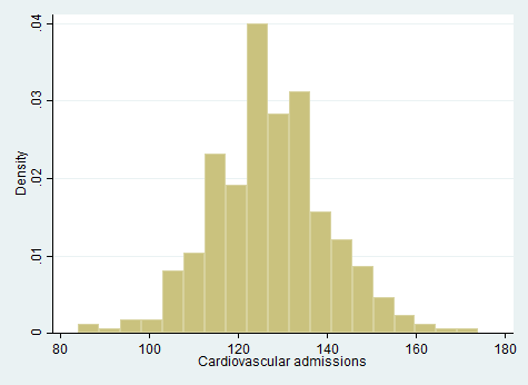
When making a prediction for how many cardiovascular admissions there will be tomorrow, we could provide a guess in the form of a single number. In that case, we would probably want to pick a number that appears to be near the center of the distribution, such as 130. However, if we want to give a more sophisticated (and comprehensive) prediction, we could list out many possible values and indicate each one’s probability of occurring. In doing so, we would be creating a probability distribution. We could present this information either graphically or in a table. One very simple approach to creating a probability distribution based on past experience would be to use the exact proportion of times each value was observed in the past year as the probability we assign to that value for the future. If we recreate Figure 7.1 with a bin width of 1 so that each bar displays only a single value, we get a precise visual depiction of this distribution.
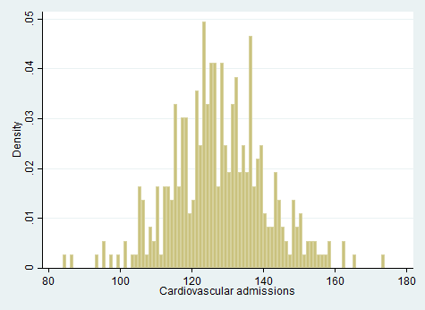
From Figure 7.2, we might begin to spot some problems with the simple approach of using last year’s proportions as direct probabilities for forecasting. The data looks a bit “choppy,” with some bars noticeably taller or shorter than those surrounding them. In the tails, the issue is particularly pronounced. For example, some values (e.g., 91, 92) were never observed in the last year, but that doesn’t necessarily mean they have 0 probability of occurring in the future.
A savvier approach to making a prediction might be to take the general shape of this distribution of past occurrences but then smooth it out since we have no reason to believe that the probability of one number should differ much from the numbers immediately around it. One way to accomplish this is to use one of the many well-known distributions that statisticians have developed to describe data generated under various assumptions. We can pick a distribution that resembles the general shape we see here. Let’s try a normal distribution,1 since it is the most widely-used distribution.
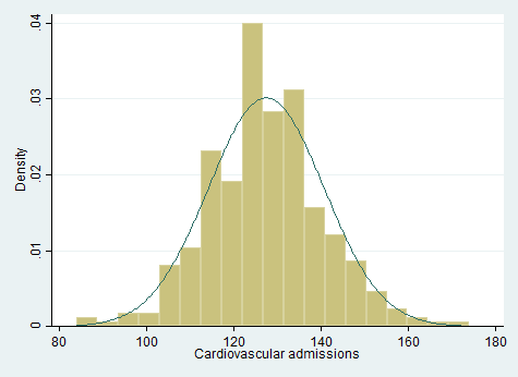
We can see in Figure 7.3 how the normal distribution provides a smooth curve that generally matches the shape of the distribution of observations from 2018. The height of the normal distribution indicates the probability associated with draws from that area of the curve, so values between 120 and 140 are more likely to occur than values between 140 and 160, according to this probability distribution. There are ways we could further refine our prediction for future visits, such as by differentiating among days of the week (more cardiovascular ER admissions occur on Mondays and Fridays) and accounting for the fact that we probably observe more outliers than the normal distribution assumes. (Technically, a Poisson distribution would also be more appropriate for this data since the number of admissions will always be a whole number, and the normal distribution is more appropriate for situations where we measure a variable to many digits.) Still, you can see how the normal distribution could provide a reasonable basis for making predictions about the relative probability of observing different values for the number of visitors in the future. More generally, this example demonstrates how a probability distribution can be used to think about possible values that may occur for a variable.
We learned in Chapter 2 that a distribution describes how frequently every possible value for a variable occurs in a dataset. In contrast to this sort of distribution, a probability distribution doesn’t describe data we’ve collected; instead, probability distributions are used to describe a (theoretical) process and indicate how likely we are to obtain different possible values from this random process.
This distinction between a distribution of data versus a probability distribution is subtle but important. For example, if we write out the (theoretical) probabilities for each possible outcome of a die roll (1, 2, 3, etc.), we’re talking about a probability distribution. If we roll a die 20 times and record the results, we’re looking at a distribution of data. Because there is plenty of variability from one player’s die rolls to the next’s (some will be luckier than others), the distribution of one player’s results will not necessarily provide a close match to the theoretical probabilities associated with a die roll (where each of the six values on a six-sided die have a probability of 1/6 each).
Another way to think about this distinction is that for a distribution of data we’ve collected, each observation was (theoretically) drawn from the probability distribution. In our example from the box above, if we have a distribution that describes how likely we think it is that we get various numbers of patients visiting the ER on a given day, we’re looking at a probability distribution. If we’re looking at data (e.g., a histogram) of past daily totals for the number of patients who visited the ER, we’re looking at a distribution of data (not a probability distribution).
Many of the same statistics and words we use to describe data that’s been collected can also be used (with a bit of adaptation) to describe probability distributions. For example, a probability distribution will (often) have a mean (also called the expected value) and a variance. A probability distribution can be skewed or symmetric. It can be bimodal or unimodal.
Probability distributions can be described using (usually complex) equations, but in this text, we’ll mainly depict probability distributions graphically. We generally depict complex (continuous) distributions by plotting what is called a probability density function (PDF). The normal distribution depicted in the box above for ER visits is an example of a PDF. Statisticians have developed PDFs for distributions with many different shapes.
You can basically interpret a graph of a PDF like a kernel density plot (or even a histogram): for values where the graph is taller (indicating greater “density”), those values are more likely to occur. But kernel density plots and histograms are used for data that we’ve already collected; PDF graphs depict a probability distribution from which data can be theoretically “drawn” (you can’t necessarily tell the difference between a kernel density plot and a PDF plot from just looking at the graph). A precise interpretation for PDFs is a bit tricky since any value can be measured to infinite digits (and therefore has infinitely small probability of being selected) when we are discussing continuous distributions like the normal distribution. The total area under a PDF will always equals 1. To calculate actual probabilities, we need to identify a range of values: for example, we can use software (or various online calculators) to determine the probability of drawing a value between 0 and 0.7 for a well-known continuous distribution. This probability will be equal to the area under the line within that range (which can be found using calculus). Our statistics software will often be relying on calculus behind the scenes based on these PDFs to provide relevant statistical results.
A random variable is a term used to describe a variable generated through draws from a probability distribution.
7.1.1 Normal distributions
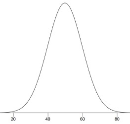
Normal distributions are one of the most important sets of probability distributions we use in statistics. As can be seen in Figure 7.4, a normal distribution has a symmetrical shape called a bell curve. Many variables in nature appear to approximately follow a normal distribution. For example, if you measure the heights of a population of adult humans belonging to a single sex (male or female), the distribution should look similar to a normal distribution. We often encounter normal distributions because of a principle called the central limit theorem, which states that any variable that results from adding up many small, independent factors will approximately follow a normal distribution.
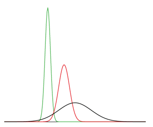
All normal distributions have the basic “bell curve” shape seen in Figure 7.4, but we can get different versions of the normal distribution by shifting this curve to the left or right, and by squishing or expanding the width of the curve. Figure 7.5 illustrates this by showing three different versions of the normal curve in one graph. Any normal distribution can be uniquely identified by its two parameters: the mean (\(\mu\)) and standard deviation (\(\sigma\)). Because the normal curve is unimodal and symmetric, the mean, median, and mode are all equal to one another. Thus, the mean can be identified visually as the tallest point (the mode) on the curve. Changing the mean will move the curve to the left or to the right; in Figure 7.5, the mean must be smallest for the green curve since it is furthest to the left (although no axis labels are provided). Changing the standard deviation will expand or narrow the width of the curve; the black curve in Figure 7.5 has the largest standard deviation since it is the widest curve. As noted above, all probability density functions have a total area under the curve equal to one, so the narrower versions of the normal distribution (e.g., the green one in Figure 7.5) have to be taller than the wider curves in order to maintain that same area of 1 under each curve.
There are some numbers you can memorize to help describe the probabilities associated with any normal distribution:
68% of the area under a normal curve is within approximately one standard deviation of the mean
95% of the area under a normal curve is within approximately two standard deviations of the mean2
99.7% of the area under a normal curve is within approximately three standard deviations of the mean
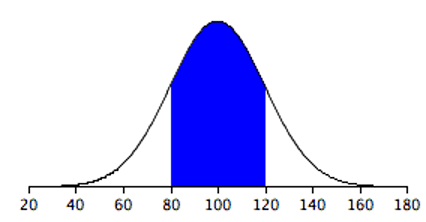
Let’s consider the normal distribution with a mean of 100 and a standard deviation of 20. To find the range describing one standard deviation from the mean, we first subtract the value of the standard deviation from the mean to find the lower bound (100 - 20 = 80), and then we add the standard deviation to the mean to find the upper bound (100 + 20 = 120). We can then say that there is a 68% chance that a draw from this distribution will yield a number between 80 and 120. Figure 7.6 shows this visually, with the blue highlighted region representing an area of 0.68 (compared to a total area of 1 under the entire cure).
To consider two standard deviations from the mean, we would first multiply the standard deviation by two (20 × 2 = 40). For the lower bound, we subtract this value from the mean (100 - 40 = 60), and for the upper bound we add (100 + 40 = 140). Thus, there is a 95% chance that a draw from this normal distribution yields a value between 60 and 140.
Using a normal distribution calculator (available online3 or in statistical software), we can easily determine the areas for other ranges of values. For example, still looking at this same normal distribution (mean=100, standard deviation=20), we could discover that the area for values less than 65 is 0.04, meaning there is a 4% chance a draw will yield a value less than 65.
The standard normal distribution refers to a normal distribution with a mean of 0 and a standard deviation of 1. This name is related to the term standardization we encountered in Section 2.6.1; recall that standardizing a variable means transforming it so that its mean is 0 and its standard deviation is 1. The standard normal distribution, and other closely related distributions, are often utilized in statistical tests. Sometimes, variables or individual values are standardized (turned into Z scores) and then compared to the standard normal distribution.
7.2 Models and Uncertainty
Before I leave my house each morning, I need to decide whether to take an umbrella. So I check my phone to see whether it’s supposed to rain. Instead of giving me a direct yes or no answer, the weather app tells me the percent chance of rain for the day.
Why does the weather app give me a percentage? Because there’s uncertainty. Science has done a lot to help us understand the weather. And as our understanding of the weather improves, our predictions get better. But we still can’t predict rain perfectly.
Facing uncertainty is a common problem when we’re looking at data. Whether we’re trying to explain the weather, human behavior, or even plant growth, we can’t make perfect predictions because there are things we can’t fully explain with our current scientific knowledge.
In statistics, we have several tools that allow us to acknowledge uncertainty. This enables us to build models like the ones powering my weather app—models that give us a prediction that includes a description of how uncertain we are. Some days we are 100% sure it will rain, other days only 60%.
In order to build these models that acknowledge uncertainty, we need a way to talk about what we do know and what we don’t know. Consider this simple example of a model that accounts for uncertainty:
\[ happiness = 3.0 + 2.3 \times income + \varepsilon \tag{7.1}\]
This model attempts to explain one’s level of happiness based on their income. You might notice that it looks very similar to the regression equations we saw in Chapter 3, except that we have added an extra term at the end (\(\varepsilon\)). That’s because regression is one of the main tools used to estimate a model that includes uncertainty.
What does this model mean in practical terms? Well, there are no obvious units we can use to quantify the amount of happiness someone experiences, so the exact values of the numbers we see are not particularly meaningful. But the fact that there’s a positive number (2.3) that is being multiplied by income implies that as income gets bigger, happiness gets larger.
The key part of this equation that I want to focus on is the little Greek letter at the end of the equation: \(\varepsilon\). This letter is called “epsilon,” and it is often used to represent what we call an error term (also sometimes called a disturbance term). The error term (\(\varepsilon\)) represents everything else besides income that affects happiness. It is a formal acknowledgement that if all we know about someone is their income, we will have uncertainty about their exact level of happiness. An error term (\(\varepsilon\)) in the model makes clear that we only claim to have a partial understanding of happiness, not a complete one.
The first part of our model that appears on the right side of the equation (\(3.0 + 2.3 \times income\)) is the systematic part of our model. It’s what we would use to build a prediction of happiness if all we knew about someone was their income level. Suppose, for example, that someone has an income of 4 units (perhaps income is measured in tens of thousands of dollars of annual income, so a salary of $40,000 is coded as a 4). According to our model, that person’s happiness would be:
\[ happiness=3.0+2.3 \times (4)+\varepsilon \] \[ happiness=12.2+\varepsilon \]
We, therefore, predict that someone with an income of 4 will have a happiness of 12.2, but we also acknowledge that their actual happiness will likely be at least a bit different from our prediction since our model indicates that their actual happiness will equal 12.2 plus the value of the error term (\(\varepsilon\)).
The error term describes something unknown, so we can’t measure it or directly observe it. But what we can do is talk about its characteristics using concepts from probability theory. Specifically, we’re going to describe the value of the error term as being randomly drawn from a probability distribution.
7.2.1 Assumptions About Error Terms
It’s easy to write out an equation that includes an error term, but we are not going to be able to do much with our model unless we make some assumptions about the error term. One of the most important (and challenging) parts of doing statistical analysis is making assumptions about the possible values of the error term. Different assumptions about the error term can result in very different conclusions.
As one example, we might assume the following things about the error term (\(\varepsilon\)):
- The values of the error term (\(\varepsilon\)) can be described by a normal distribution with a mean of 0
- Knowing someone’s income doesn’t help us predict the values of the error term (\(\varepsilon\))
What do these two assumptions mean?
First, if the error term (\(\varepsilon\)) follows a normal distribution with a mean of zero, that means that (according to our model), people are just as likely to have a positive value of the error term as they are to have a negative value of the error term. In other words, all those factors we haven’t accounted for in our model are equally likely to push people in the direction of being happier or in the direction of being less happy. Our model and assumptions tell us that if we predict happiness purely based on income, we’ll overestimate some people’s happiness, and we’ll underestimate an equal number of people’s happiness.
Second, these assumptions allow us to describe how much individual observations will tend to deviate from our income-based predictions. We haven’t specified in our assumptions what the standard deviation is for the normal distribution for the error term (\(\varepsilon\)), but statistical analysis will let us estimate the standard deviation of an error term. And we know that there is a 95% chance of drawing a value within two standard deviations of the mean for any normal distribution. So whatever the standard deviation of the error term (\(\varepsilon\)) is, we would expect that 95% of the time, the error term will take on a value that is within two standard deviations of zero. Conversely, 5% of the time, the error term will take on a value that is more than two standard deviations away from zero. Suppose that the standard deviation of the error term (\(\varepsilon\)) happens to be three. If we have a dataset containing the income and happiness of 1,000 randomly selected people, we would expect that about 950 of these people will have a level of happiness that falls within six units of our income-based prediction. But for about 50 of these people, our prediction of their happiness will be off by more than six units.
Third, our assumptions imply that income is not tied in any consistent way to (the total sum of) factors other than income that also affect peoples’ happiness. Remember, the error term (\(\varepsilon\)) represents all factors other than income that affect satisfaction. If income is related to these other factors, then the value of income should help us predict the value of the error term. For example, if having a stable environment in childhood directly causes (on average) both higher incomes and greater happiness in adulthood,4 the error term will partially reflect the effect of childhood stability on happiness, so high incomes (which are partially caused by childhood stability) will probably be predictive of a more positive error term. This would constitute a violation of our assumptions since we indicated that income wasn’t predictive of the error term. As this example illustrates, our assumptions about error terms are often quite strict, making it rather difficult in practice to build good models that account for uncertainty. This example also illustrates how problems of causality can often be conceptualized as violations of assumptions about the error term; in Chapter 9, we will see that we can label the problem posed for our analysis by the effects of childhood stability a “third-variable problem,” but here we have shown how it can also be understood as problematic correlation between the dependent variable and the error term.
If you want to explore in more detail how equations can be used to describe statistical models, this chapter’s appendix provides a more formal presentation of some ideas from this section.
7.2.2 Models and Probabilistic Thinking
Despite the difficulty inherent in building models that accommodate uncertainty, we have little alternative unless we wish to build only deterministic models, meaning models that are supposed to predict with 100% accuracy. Little (if anything) about the social world follows absolute laws, so deterministic models are arguably not well suited to social scientific study. Instead, the best we can hope for is a probabilistic model, indicating the conditions under which particular outcomes are more or less likely. And fortunately, our models do not always have to be perfectly correct in order to generate useful predictions or explanations. As the statistician George Box famously said, “all models are wrong, but some are useful.”
An important part of learning to do good statistical analysis is learning to think clearly about models so that you can pick out a model that is useful for whatever it is you want to accomplish. And the first step toward understanding many statistical models is learning to think about the world in probabilistic terms, as we’ve done throughout this chapter. Probabilistic thinking asks questions like:
Based on what I do know and what I don’t know, what can I predict?
How does adding or removing different pieces of information change my prediction?
How much uncertainty is there in my prediction?
How often will my prediction differ greatly from what actually happens (even if my model is correct)?
7.3 Exercises
- What is the difference between a distribution of data and a probability distribution?
- What are the two parameters of a normal distribution?
- A draw from a normal distribution with a mean of 5 and a standard deviation of 10 has a 95% chance (approximately) of being between ______ and ______.
- A draw from a normal distribution with a mean of ______ and a standard deviation of ______ has a 68% chance (approximately) of being between 80 and 100.
- What is size of the total area underneath a PDF?
- If the area underneath a PDF between 3 and 5 is .31, what is the probability of drawing a value between 3 and 5?
- What is unique about the standard normal distribution (compared to other normal distributions)?
- What does an error term represent?
- In social science, do we normally use deterministic or probabilistic models? What is the difference?
Chapter 7 Appendix: Expected Values and Conditional Probabilities
Let us now practice using equations to more formally describe some of what we discussed in the main chapter. Given our assumptions and the equation representing our model of happiness, we can use the notation of expected value to express the predictions we previously made:
\[ \mathbb{E}[happiness|income=4]=\mathbb{E}[(3.0+2.3 \times (4)+\varepsilon)|income=4] \]\[ =12.2+\mathbb{E}[\varepsilon|income=4] = 12.2 \]
We use \(\mathbb{E}\) to indicate an expected value and the symbol \(|\) indicates “conditional on,” meaning that we want to know the expected value of happiness conditional on income being equal to 4. Given that the error term (\(\varepsilon\)) is independent of income (our second assumption), \(\mathbb{E}[\varepsilon|income=4]\) simplifies to \(\mathbb{E}[\varepsilon]\) and since \(\varepsilon\) is drawn from a normal distribution with a mean of 0, \(\mathbb{E}[\varepsilon]=0\).
We can also apply the notion of conditionals to probabilities. For example, we might want to say something about the probability of happiness being greater than some value. To make the math simpler, I will choose values that correspond to 0, 1, 2, or 3 standard deviations from the center of the distribution of \(\varepsilon\) since that will make it easy to do the math by hand using the proportions of the normal distribution we learned in the main part of this chapter. A normal distribution calculator could be used to find probabilities for other values (e.g., greater than 1.47 standard deviations above the mean).
First, let’s consider the probability of happiness being greater than our prediction of 12.2 when income is 4:
\[ Pr(happiness > 12.2 | income=4)=Pr((3.0+2.3 \times (4)+\varepsilon)>12.2)\]\[ =Pr(12.2+\varepsilon>12.2) = Pr(\varepsilon>0) = .5 \]
From any normal distribution, half of the area under the curve will be above the mean, while half of the area will be below the mean. Since we assume \(\varepsilon\) is drawn from a normal distribution with a mean of 0, the probability of a value greater than 0 is .5. In other words, there is a 50% chance that the actual value of happiness will exceed the predicted value. Similarly, there is a 50% chance the true happiness will fall below the predicted value:
\[ Pr(happiness < 12.2 | income=4)=Pr(12.2+\varepsilon<12.2)\]\[ = Pr(\varepsilon<0) = .5 \]
Let us again assume for the moment that the standard deviation of the normal distribution from which \(\varepsilon\) is drawn is three (in real-world analysis, we can estimate the standard deviation of this normal distribution based on the data we observe). Given this value, we can now calculate other conditional probabilities. We can calculate the probability of happiness exceeding 15.2 when income is 4:
\[ Pr(happiness > 15.2 | income=4)=Pr(12.2+\varepsilon>15.2) \]\[ = Pr(\varepsilon>3) = .16 \]
For the final step, we rely on the fact that for any normal distribution, 68% of the area under the curve falls within one standard deviation of the mean. Remember, we assumed \(\varepsilon\) is drawn from a normal distribution with a standard deviation of three (and mean of 0), so there is a .68 probability of drawing a value between -3 and 3. Thus, the probability of drawing a value outside this range must be .32 (\(1-.68=.32\)). Half of this .32 will belong to the lower tail (values less than -3) and half to the upper tail (values greater than 3). Thus, the probability that \(\varepsilon\) is greater than 3 is .16.
Specifically, we use a normal distribution with mean and standard deviation set equal to the mean and standard deviation of the 2018 sample we’re examining.↩︎
As we will see in Chapter 8, a more precise value is 1.96 standard deviations from the mean.↩︎
For example: https://onlinestatbook.com/2/calculators/normal_dist.html↩︎
By “directly cause” greater happiness in adulthood, I mean that a stable childhood environment causes greater adult happiness by means other than increasing income (which in turn may increase happiness).↩︎